I created a Kinetic Typography video as part of my class project. Kinetic typography is the art of animating text to enhance meaning, emotion, and engagement through movement. This project brings words to life using motion, making the message more impactful and visually dynamic.
Creative Process
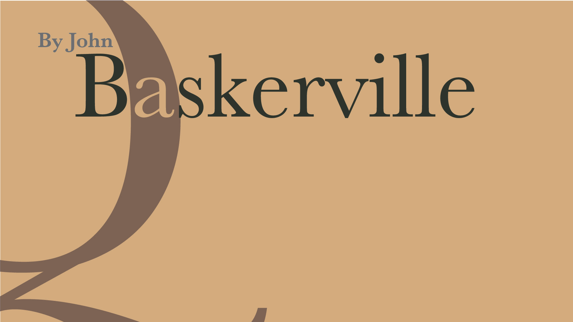
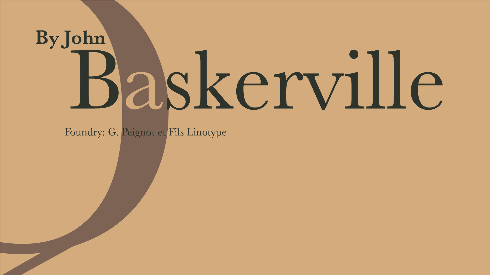
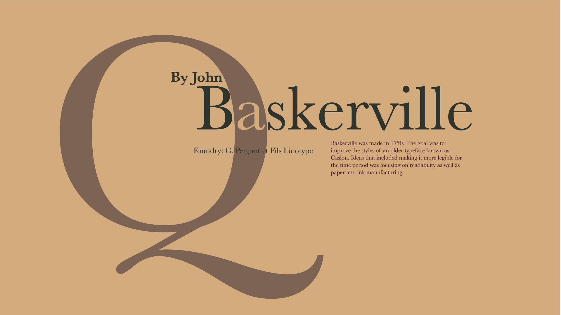
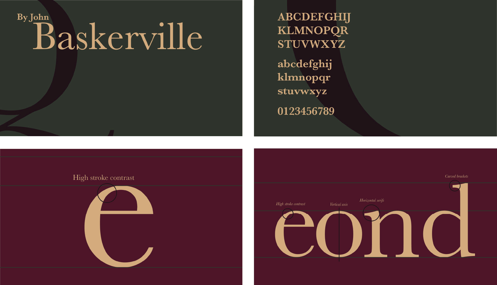
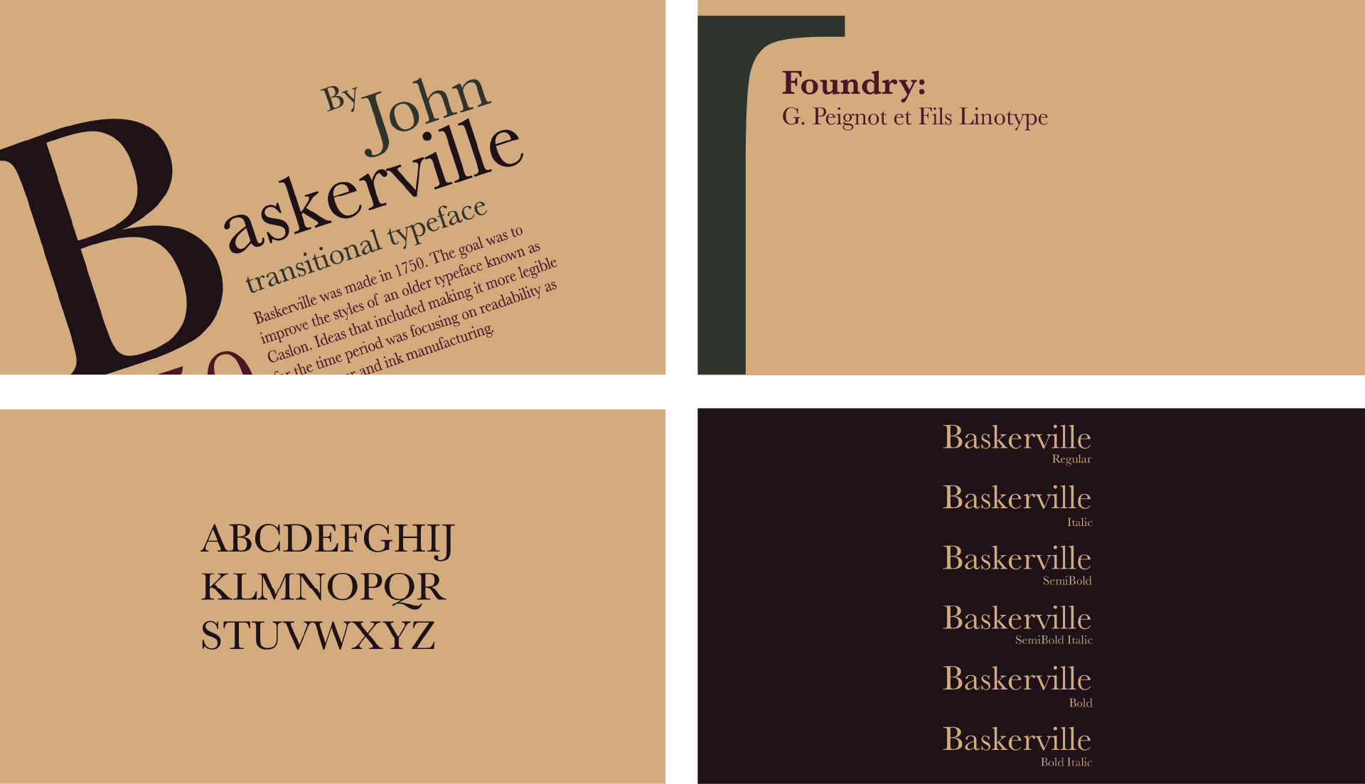
Baskerville: A Timeless Typeface in Motion
For this piece, I specifically designed an animated type specimen for Baskerville, exploring both its historical significance and contemporary applications. By combining typography and motion, I aimed to highlight the typeface’s elegance, readability, and enduring influence in a dynamic way.
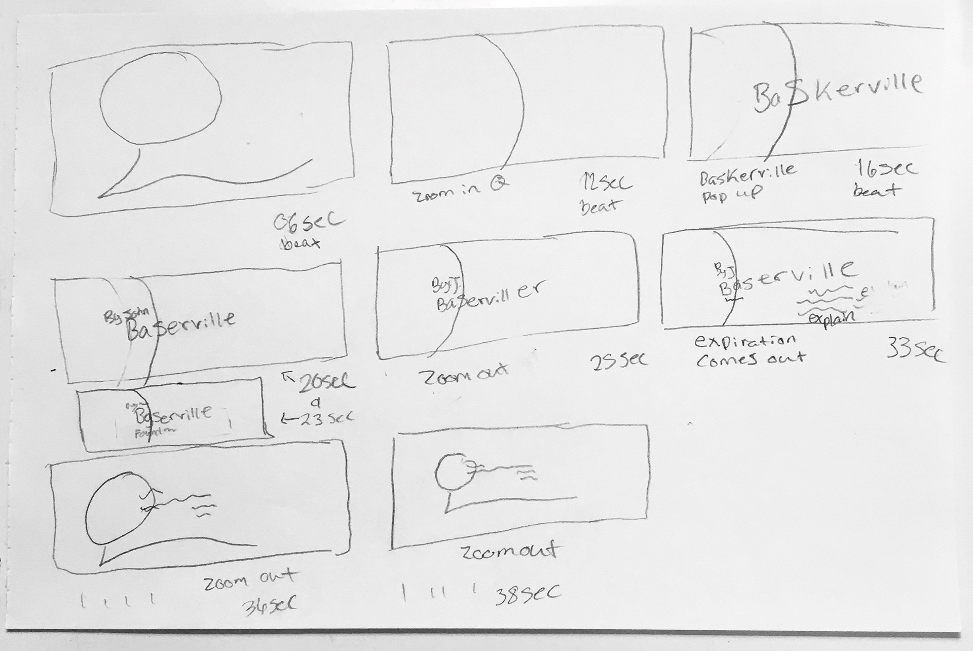
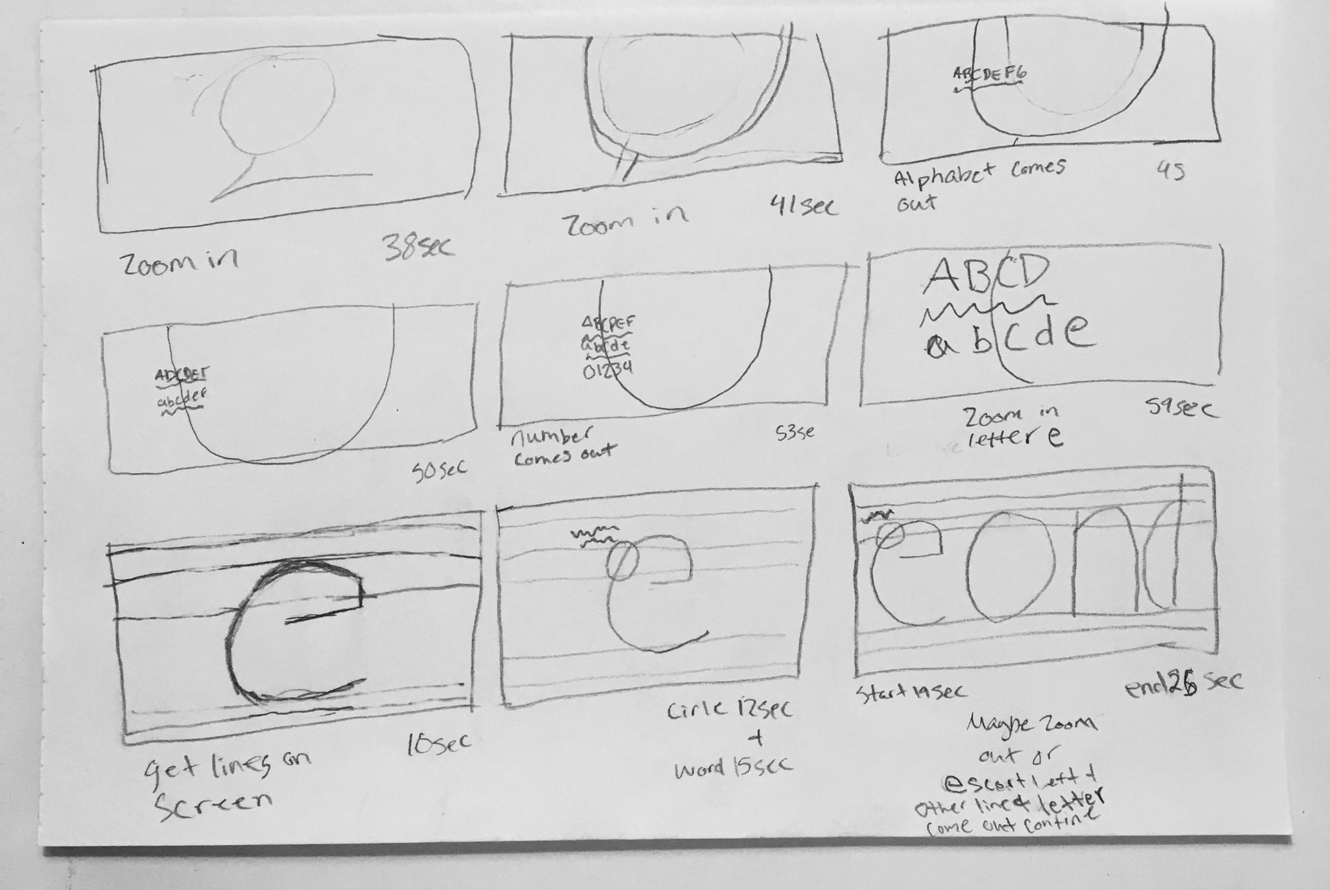
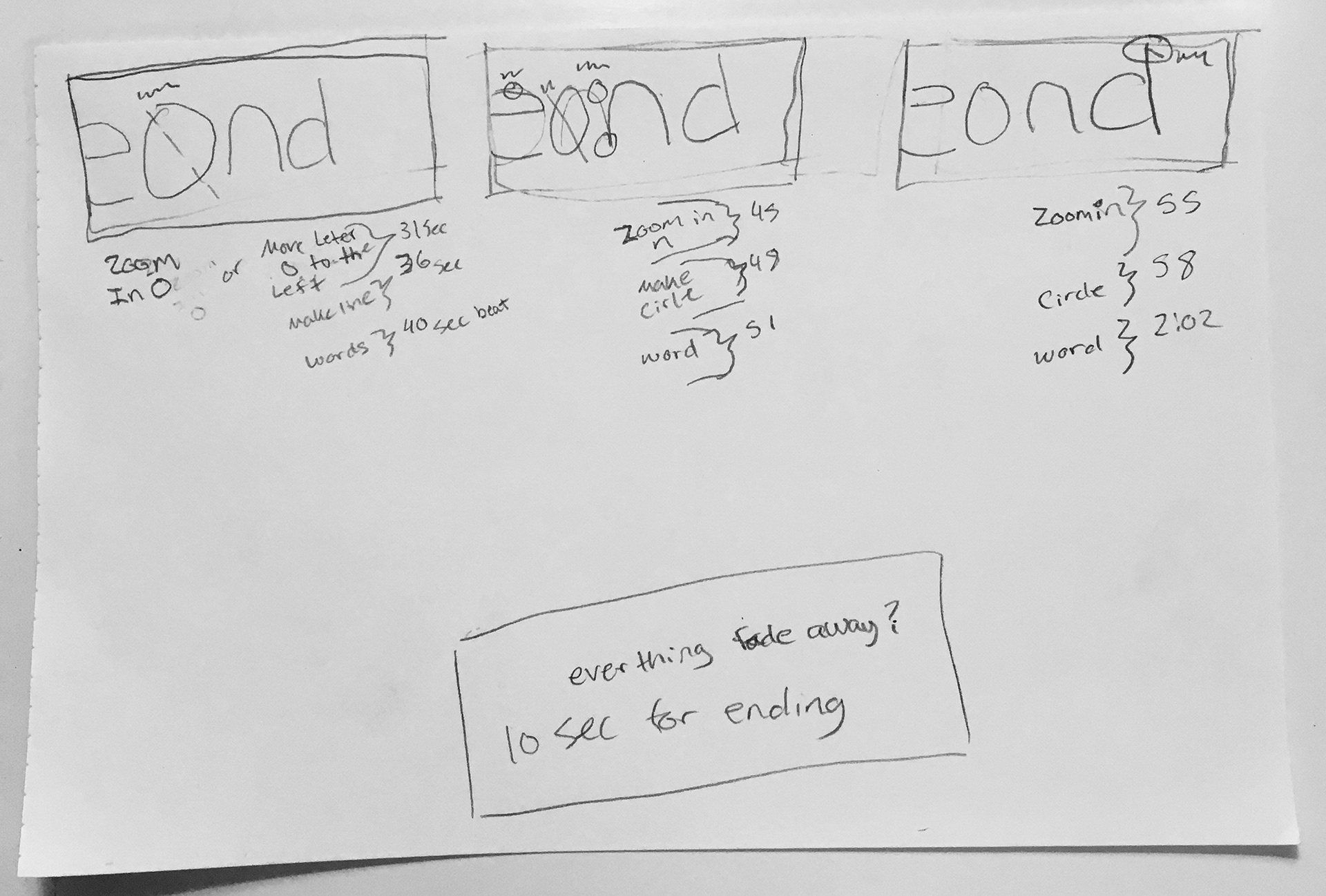
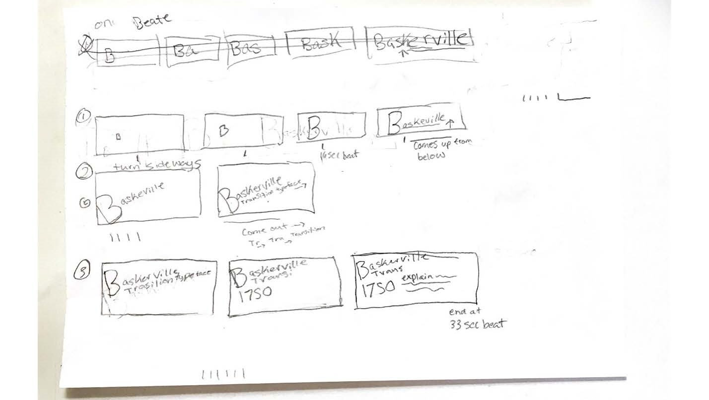
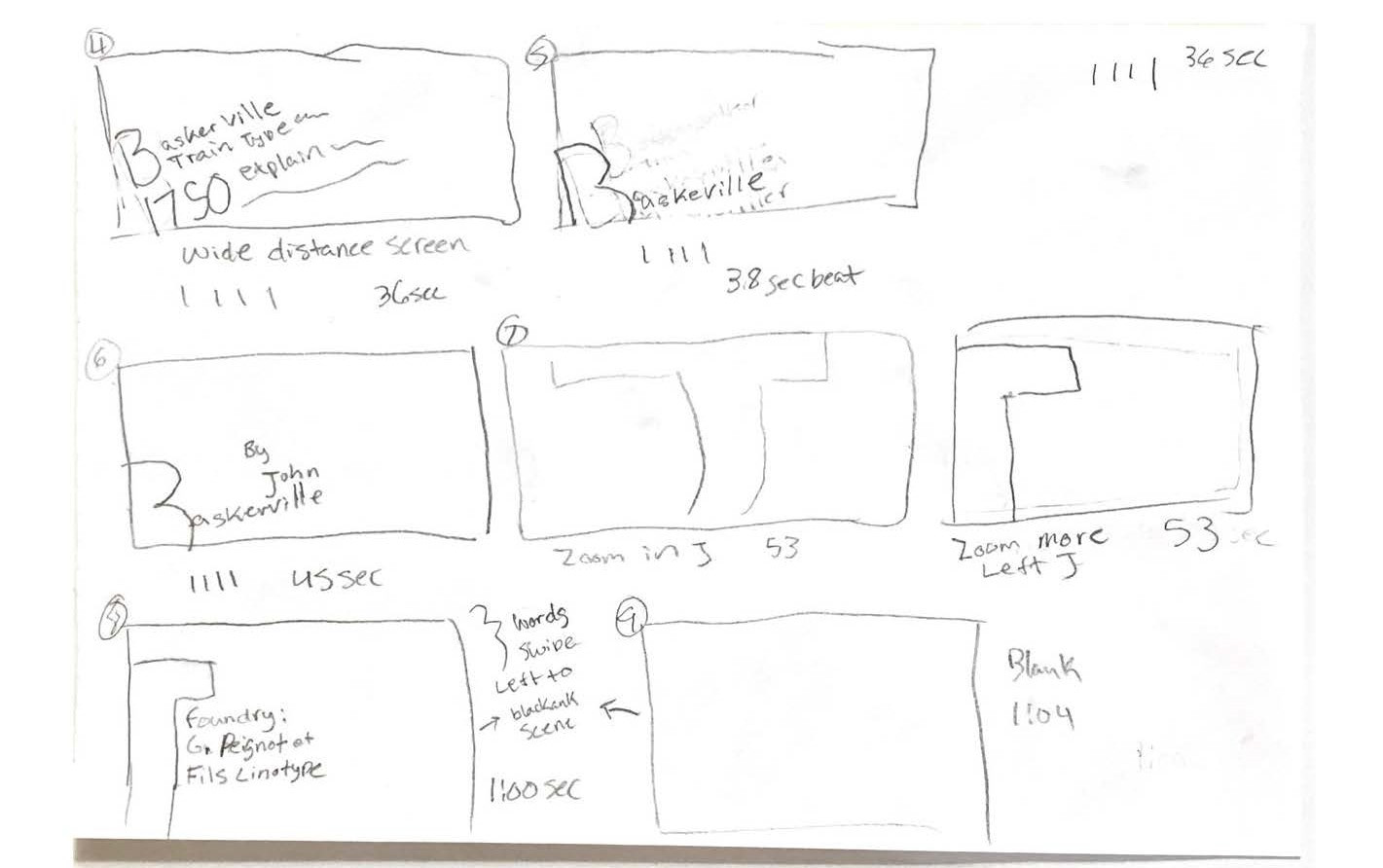
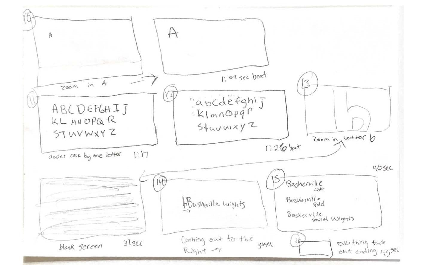
Storyboarding & Initial Sketches
After selecting the Baskerville typeface, I delved into research to understand its significance and unique characteristics. This exploration guided my creative process as I began developing initial concepts and rough ideas for the animation, ensuring that my design choices reflected the essence of the typeface.
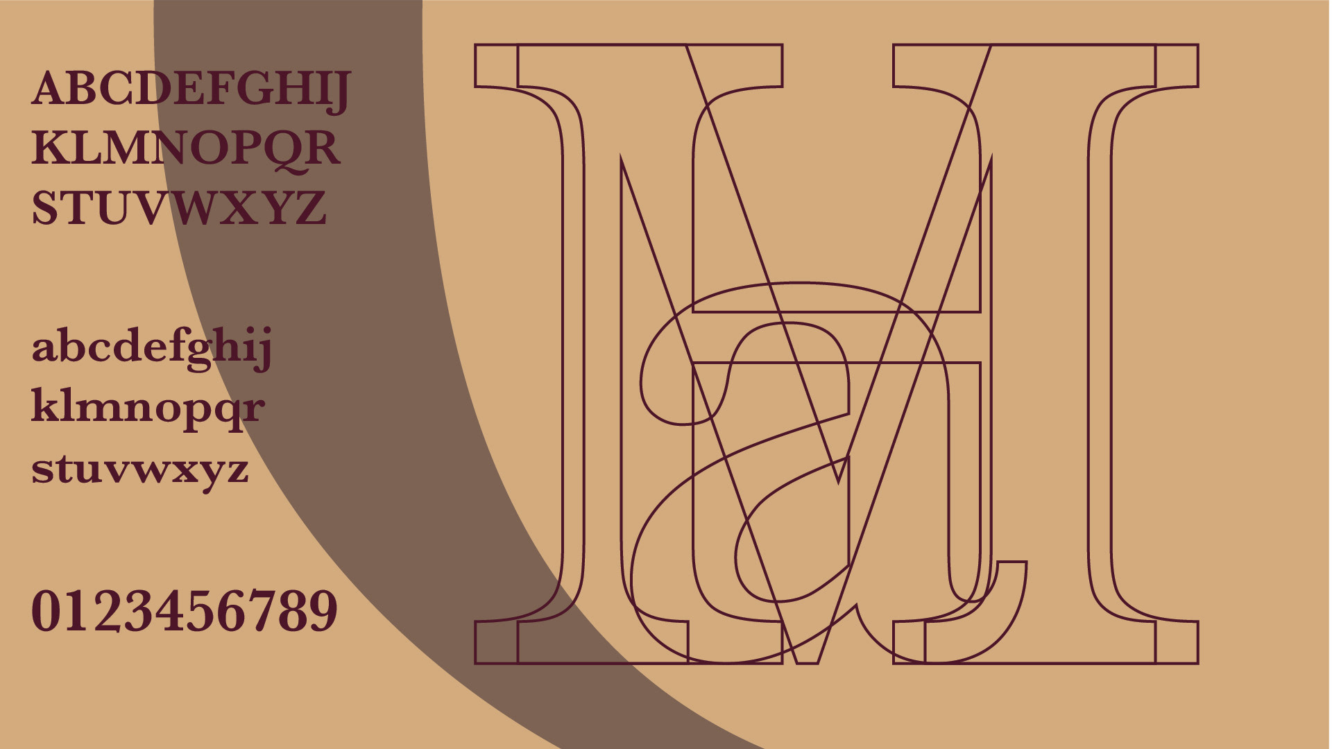
Exploring Color & Aesthetic Choices
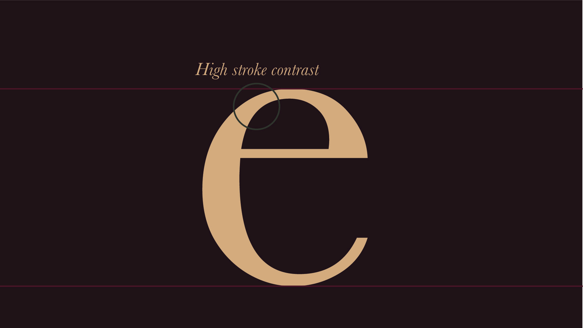
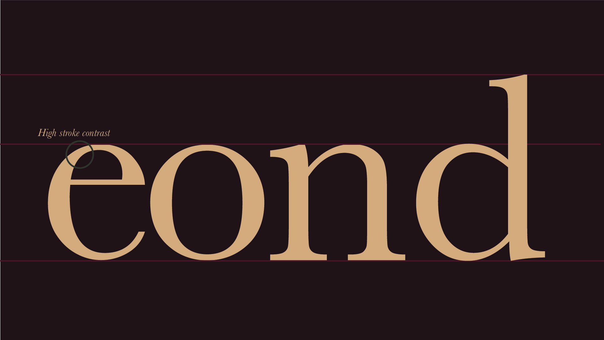
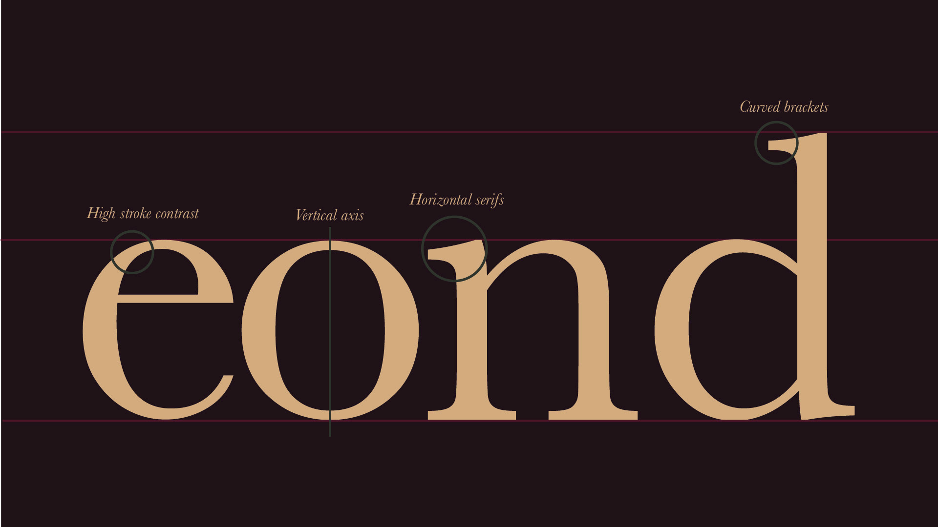
To achieve a dark academia aesthetic, I experimented with different color palettes that complemented the elegance and sophistication of Baskerville. As a transitional typeface, Baskerville bridges the gap between old-style and modern typefaces, characterized by its high contrast, sharp serifs, and refined structure. My goal was to ensure that the colors and overall design enhanced these qualities while maintaining a visually cohesive and immersive experience.
Final Storyboard & Animated Specimen
To showcase the key moments of my Kinetic Typography project, I compiled a PDF storyboard featuring snapshots from each scene. This visual breakdown highlights the most important elements of the animation, illustrating how typography, motion, and design choices come together to enhance the storytelling and aesthetic of the piece.